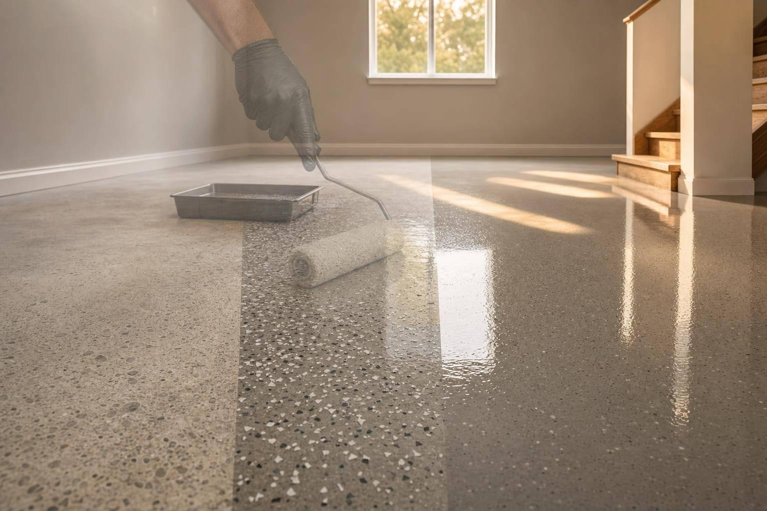
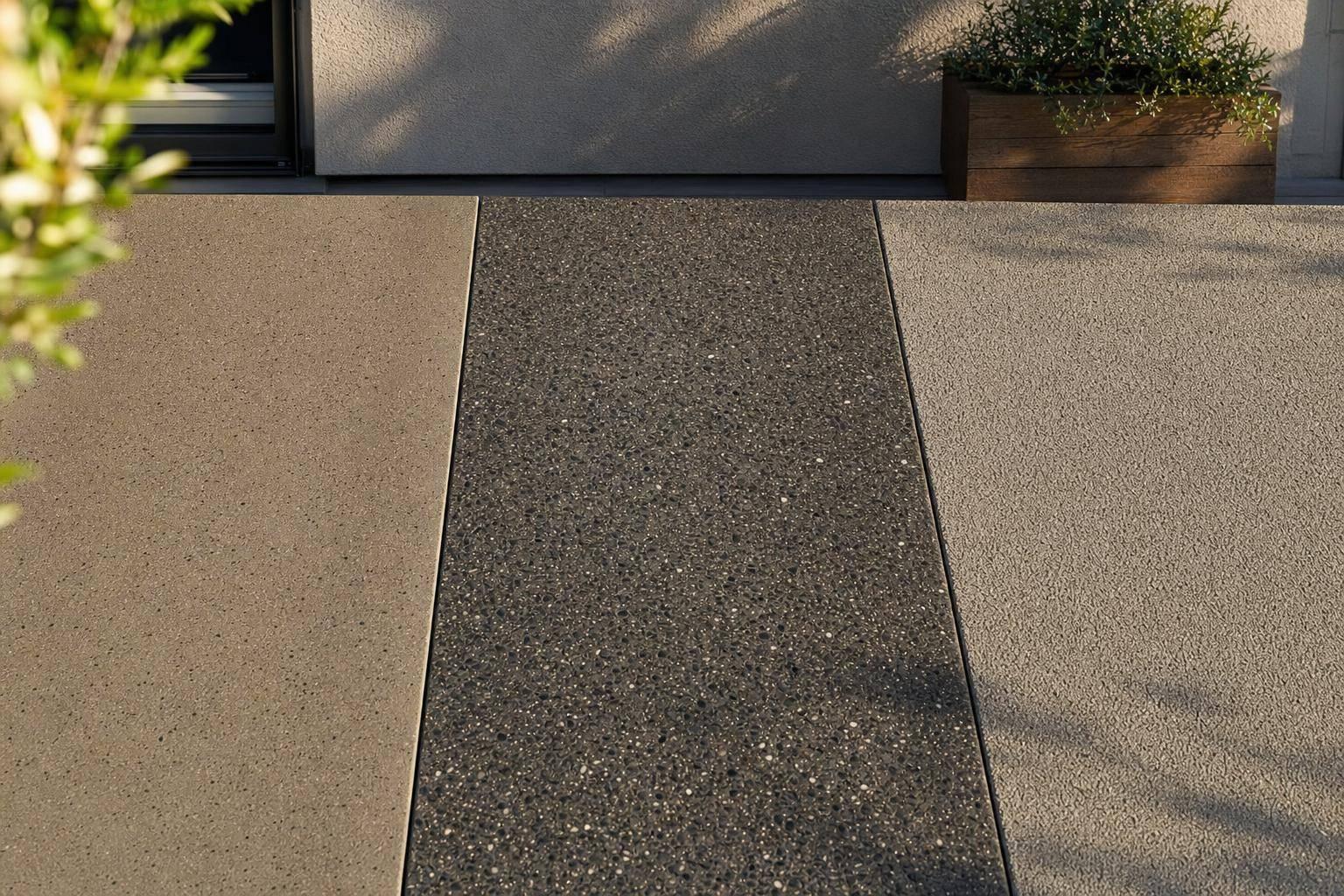
The short answer: most people should start with a mid-tone flake coating that fits the building, hides dirt, and matches how the space is used. In many cases, that means gray, taupe, or tan blends for garages, patios, basements, pool decks, and small commercial floors.
If I were narrowing it down fast, I’d focus on these points first:
- Match the property first, not the sample board. Look at siding, stone, brick, trim, cabinets, and nearby hardscape.
- Mid-tone blended colors hide mess best. Dust, salt, grit, and small marks tend to show less on speckled gray or earth-tone finishes.
- Very light solids show dark dirt fast.
- Very dark solids often show dust, salt, footprints, and pet hair.
- Patios need style plus comfort and traction. Lighter colors can stay cooler in full sun, and textured finishes help around wet areas.
- Commercial floors should be picked by use. Front areas need a clean look; work zones need grip, chemical resistance, and wear protection.
- Neutral floors age better with design changes. Bold floors fit showcase spaces better than multi-use areas.
Here’s the main idea in plain English: the best-looking floor is usually the one that still looks clean after a week of normal use. That matters in places like North Idaho and Eastern Washington, where freeze-thaw weather, road salt, dust, and pine debris can be hard on surfaces.
A few simple facts help make the choice easier:
- Full-broadcast flake systems cover the floor edge to edge, which helps mask debris better than flat solid colors.
- South- and west-facing patios can get much hotter in summer, so color choice affects barefoot comfort.
- In many daily-use spaces, neutral mid-tones give the best mix of appearance and low upkeep.
If I had to sum up the whole topic in one sentence, it would be this: pick a coating that fits the building, hides dirt, handles local weather, and makes sense for the way you use the space.
How to Match a Concrete Coating to Your Property’s Style
The first step isn’t the coating. It’s the building itself.
Before you pick a color or chip blend, study what’s already in place: siding, roof shingles, stone veneer, brick, trim, cabinetry, and even the nearby landscaping or hardscape. The goal is coordination, not a perfect match. When the floor works with the rest of the property, it feels planned instead of patched in.
Color Choices for Modern, Rustic, Farmhouse, and Classic Spaces
Your property’s architectural style is the clearest place to start. It gives you a strong read on the kind of finish that will look right.
| Style | Suggested Finish | Why It Works |
|---|---|---|
| Modern | Clean gray, charcoal, or other cool-toned blends | Reinforces simple lines, black trim, and contemporary exteriors |
| Rustic | Earth tones, brown-gray blends, warm tan chips | Complements wood, stone, and natural textures |
| Farmhouse | Warm gray, taupe, soft natural blends | Coordinates with white siding, black fixtures, and warm accents |
| Classic | Mid-tone neutrals, granite-style or subdued flake patterns | Timeless and versatile across many exterior palettes |
These are practical starting points, not hard rules. From there, fine-tune the choice based on the materials around it. For example, a charcoal floor under a sleek modern storefront feels deliberate and clean.
Using Surrounding Materials to Guide Your Finish Choice
Once you’ve narrowed down the style, the surrounding materials help you decide whether to go warm or cool.
A home with red brick and bronze fixtures will often look better with a warm neutral than a cool blue-gray. On the other hand, a business with black-framed windows and metal accents may fit a charcoal or silver-gray blend much better.
Location can shift the best option too, even within the same style. In North Idaho, homes with stone, cedar, and darker trim often look best with warm neutral blends. In newer neighborhoods in Spokane and the Tri-Cities, mid-tone gray chip systems often pair well with contemporary siding and lighter exteriors.
One thing matters a lot here: always review physical samples in natural daylight at the actual site.
Once style and surrounding materials narrow the options, the next step is figuring out which colors do the best job of hiding dirt.
sbb-itb-a0e5ae3
Which Concrete Coating Colors Hide Dirt Best
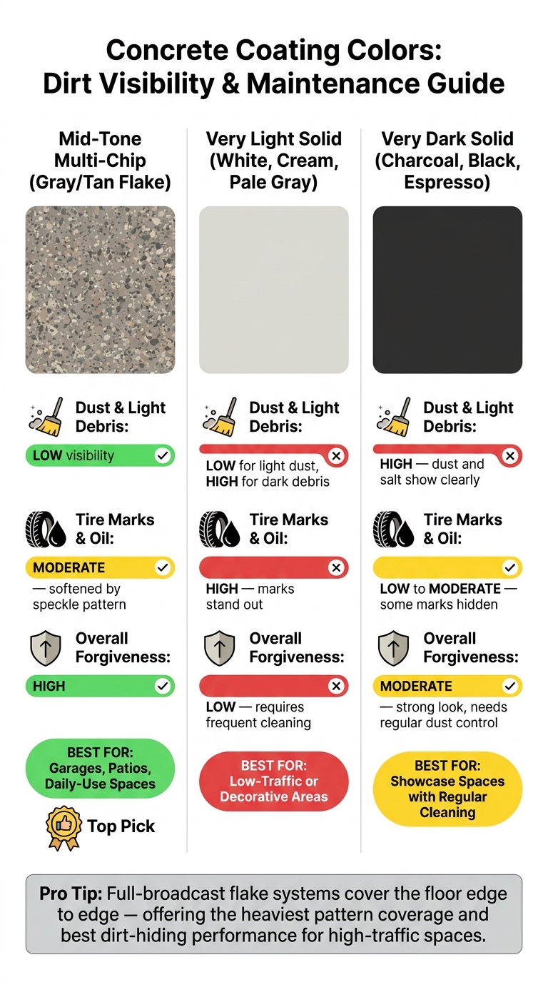
Concrete Coating Colors: Dirt Visibility & Maintenance Guide
Once the finish matches the building, the next question is simple: how much mess will it show?
Not every color holds up the same way once the floor starts seeing daily use. Foot traffic, tires, road salt, and oil drips all show up differently depending on the finish.
Why Mid-Tone Grays, Tans, and Blended Chip Systems Are Easier to Maintain
Mid-tone grays, taupes, tans, and blended chip systems tend to be the easiest to live with day to day. The reason is pretty straightforward. A medium-value color doesn’t create a harsh contrast with the dirt and debris that land on it. Dust, tracked-in mud, leaf bits, and salt residue are more likely to blend into the surface instead of jumping out at you.
Multi-chip, or flake, systems help even more. That speckled pattern breaks up the look of small debris and wear marks, so footprints, minor oil drips, and fine grit don’t stand out as much. The floor looks cleaner between washings, which matters if the space gets used hard. Full-broadcast flake systems, where chips cover the floor edge to edge, offer the heaviest pattern coverage and do the best job hiding dirt.
The same idea holds up in winter. In colder parts of the country, where road salt, slush, and sandy grit get tracked in all the time, a medium-speckled gray or earth-tone blend does a much better job masking debris than a flat, even finish.
Light vs. Dark Solid Finishes
Very light solid finishes like white, cream, and very light gray can look crisp and bright. But they also show dark debris fast. They make more sense in low-traffic areas, and they need steady cleaning if you want to keep that just-finished look.
Very dark solid finishes like charcoal, black, and espresso come with the opposite issue. They can hide some stains, but they often show dust, footprints, pet hair, light-colored road salt deposits, and surface debris more than people expect. Under bright light, swirl marks and uneven wear can also become easier to spot.
| Finish Type | Dust & Light Debris | Tire Marks & Oil | Overall Forgiveness |
|---|---|---|---|
| Mid-tone multi-chip (gray/tan flake) | Low visibility – the pattern breaks up debris | Moderate – softened by the speckle pattern | High – best balance for garages and patios |
| Very light solid (white, cream, pale gray) | Low for light dust, high for dark debris | High – marks stand out | Low – requires frequent cleaning |
| Very dark solid (charcoal, black) | High – dust and salt show clearly | Low to moderate – some marks are hidden | Moderate – strong look, but needs regular dust control |
If easy upkeep is the goal, a mid-tone blended chip system is usually the safest bet. Bold solid colors can still look great, but they make more sense in spaces where regular cleaning isn’t a problem.
That balance shifts a bit on patios and in commercial settings, where looks and day-to-day use don’t always carry the same weight. The next step is figuring out whether the space needs a patio-ready style or a finish with a more business-first feel.
How to Choose Patio and Commercial Concrete Finishes
Once you’ve picked a color, the next step is choosing a finish that fits the space. The same basic thinking applies to patios and commercial floors, but the goal changes. Outdoors, appearance tends to lead. In business settings, day-to-day use usually comes first.
Picking Patio Colors That Work with Your House, Yard, and Furniture
Start with what’s already there: your home’s siding, roof, and nearby hardscape. For example, a house with white siding and black trim usually pairs well with a cool mid-gray base and black-and-white chips.
After that, look at your yard and outdoor furniture. Wood pergolas and warm deck railings often pair better with earth-tone blends. Metal railings, composite decking, and modern planters usually look better with cooler grays. Even small details can help steer the choice. Outdoor cushions, planters, and the finish on your grill can all point you toward the right accent chip colors in a blended system.
Sun exposure matters more than many people think. On south- or west-facing slabs that get full afternoon sun, lighter colors stay cooler underfoot and tend to show less fading over time. Darker surfaces soak up more heat, which can make them rough on bare feet in summer. Around pools and other wet areas, a textured finish with solid slip resistance helps keep the surface safer.
Commercial spaces need that same sense of coordination, but traffic, traction, and wear carry more weight.
Choosing a Commercial Finish Based on Function and Business Image
For business owners, the first move is to separate customer-facing areas from work areas. Even in the same building, those spaces often call for different finishes.
In customer areas like retail floors, lobbies, and showrooms, the coating should look clean, mop up easily, and hold up against scuffs. In back-of-house spaces such as service bays, stock rooms, and other work zones, the focus shifts to impact resistance, chemical resistance, and traction. Near glass storefronts and entrances with strong daylight, UV-stable topcoats are a must to help stop yellowing or fading in spots where the sun hits the floor day after day. In work areas exposed to oils or cleaning agents, a system rated for chemical resistance helps guard the floor against softening or staining over time.
Fast-curing systems can help small businesses cut downtime. Installing over a weekend or during a slow season can also reduce disruption.
Once the function is clear, the last call is simple: should the floor fade into the background, or should it make a statement?
Bold vs. Neutral Finishes: How to Make the Right Call
After style, dirt visibility, and function, there’s one last call to make: should the floor stand out or fade into the background? That choice matters more than people think.
A bold finish turns the floor into the star of the room. Think high-contrast flake blends, deep charcoals, and strong patterns. A neutral finish does the opposite. Mid-tone grays, warm tans, and soft gray-beige blends let cabinets, furniture, walls, and decor do the talking.
When to Go Bold and When to Stay Neutral
Bold works best when the space feels personal and is meant to make a statement. A showcase garage with custom garage cabinets, a brand-centered retail showroom, or a modern patio with dramatic architecture can all handle a floor that draws the eye. In spaces like these, a high-contrast finish adds to the look instead of fighting with it.
Neutral is often the smarter pick when flexibility matters. If you might repaint, swap out furniture, change tenants, or sell in the near future, a neutral floor gives you more room to change things without creating a mismatch.
The simplest way to make the call? Look at the room’s job and how long you want the design to feel current.
| Space | Bold Finish | Neutral Finish |
|---|---|---|
| Garage | Bold: showcase or hobby spaces | Neutral: daily use and resale |
| Patio | Bold: strong architectural statement | Neutral: easier coordination |
| Commercial interior | Bold: brand-centered spaces | Neutral: multi-tenant or professional settings |
Still torn? Go with a neutral base, then bring in bolder color through small accents.
FAQs
How do I choose warm or cool tones?
Choose based on the mood you want and how you use the space. Warm tones tend to feel cozy and welcoming. Lighter, cooler tones can help a small room feel more open because they reflect more light.
It also helps to think about the room’s job. Neutral tones usually give you the most flexibility in residential spaces, while brighter colors can fit nicely in playrooms. Use color swatches to see how each tone looks with your lighting and decor.
What coating works best for snowy, dirty areas?
For snowy, dirty areas, go with a slip-resistant, high-traction textured system. Wet surfaces and road grime make smoother finishes more slippery, so texture matters here.
Croc Coatings’ Penntek Evolution is made to stand up to road salt, oil, and temperature swings. For exterior wet or sloped areas, a grippier texture is usually the better fit. The trade-off is simple: more texture can hold onto more dirt, so you may need to clean it more often.
Should I choose a bold floor or a neutral one?
It depends on the purpose of the space and the look you want.
In homes, neutral tones are often the go-to choice because they blend in easily with existing decor. They also give you more freedom if you plan to switch up furniture, rugs, or wall colors later. If you want something with more energy, brighter colors can help define different areas or set a certain mood.
In commercial spaces, color can do more than change the look of a room. It can help direct foot traffic and make different zones stand out. Color swatches and samples are a smart way to check how a finish looks under your lighting before you make a decision.