Explore Color Relationships With Confidence
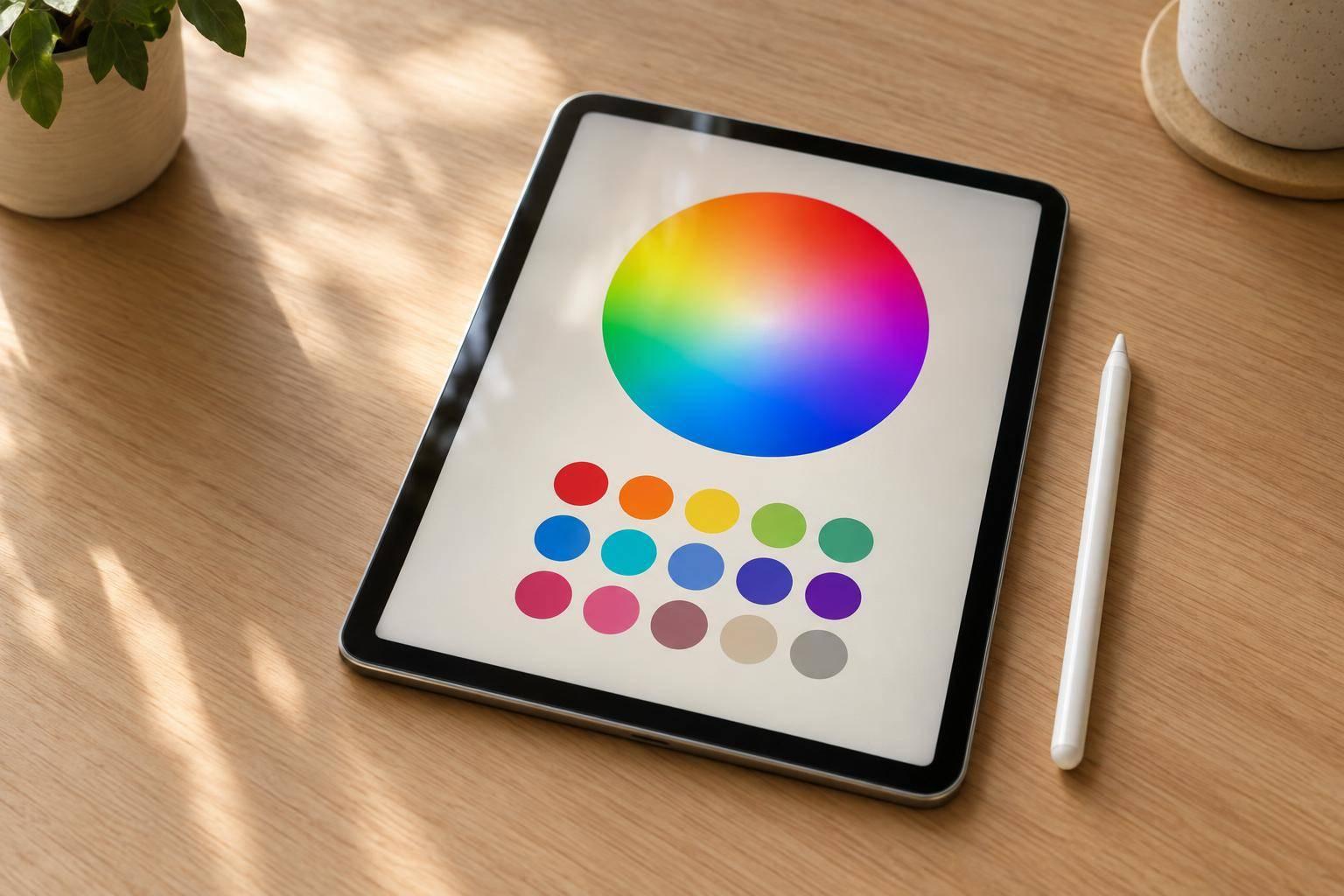
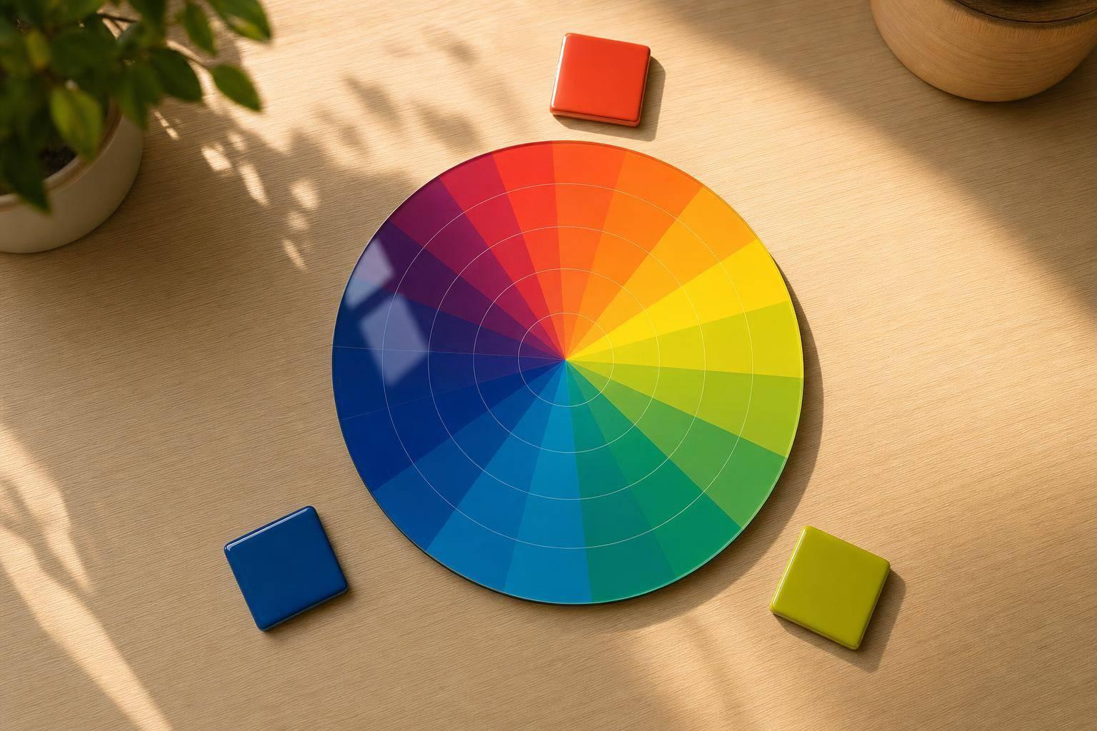
A good color wheel tool does more than show a circle of hues. It helps you understand how colors connect, which combinations feel balanced, and how to turn a single choice into a full palette you can actually use. This interactive experience is built for exactly that. Start with any base color, then switch between complementary, analogous, triadic, split complementary, tetradic, or monochromatic modes to see related options instantly.
Built for Fast Palette Discovery
Designers, developers, marketers, and students often need quick answers when working with color. This interactive color wheel makes that process visual and practical by syncing HEX, RGB, and HSL values in real time. You can adjust hue, saturation, and lightness, compare swatches on light or dark backgrounds, and click any generated color to keep exploring.
Clear Conversions, Better Decisions
A strong color harmony generator should help you move from inspiration to action without friction. By pairing live conversions with palette previews, this tool makes it easier to test ideas for branding, UI design, illustrations, and content creation. If you need a cleaner way to explore color schemes and understand how related shades work together, this is a simple place to start.
FAQs
How does the tool generate matching colors from one base color?
It starts by converting your chosen color into HSL, which makes hue-based relationships much easier to calculate. From there, the tool shifts the hue according to the harmony you select, such as 180 degrees for complementary or evenly spaced angles for triadic sets. In monochromatic mode, it keeps the hue steady and adjusts lightness or saturation to create variation without changing the core color identity.
Can I enter colors in HEX, RGB, or HSL and still get the same result?
Yes. The inputs are synchronized, so you can start with whichever format you prefer. If you type a HEX code, the RGB and HSL values update instantly. The same goes in reverse, which is useful if you’re moving between design tools, CSS values, and visual palette planning.
Is this tool useful for design accessibility and contrast checking?
It helps with the visual side of accessibility by offering clear previews on light and dark backgrounds and aiming for readable text labels where possible. It isn’t a full contrast auditing platform, but it’s very helpful for quickly spotting combinations that may be too faint, too bright, or too close in tone before you move into final design work.