A room does not need a full renovation to feel dramatically better. In many cases, the biggest visual payoff comes from small, strategic upgrades that make builder-basic features feel more intentional.
That is the core idea behind this collection of DIY tips: instead of replacing everything, improve what is already there. Add detail to plain trim. Change how lighting works. Use paint more boldly. Introduce texture where walls or windows feel flat. The result is a home that looks more layered, thoughtful, and expensive – without requiring a luxury budget.
For homeowners in North Idaho and Eastern Washington, this approach is especially practical. Whether you are updating a Coeur d’Alene bungalow, a Hayden new build, a Spokane ranch home, or a small business waiting area in the Tri-Cities, these upgrades can help you create a more polished space while keeping projects manageable.
Key Takeaways
- Layer over, don’t always replace. Stacking trim over existing baseboards can create a larger, more upscale look for less money.
- Think flexibly about lighting. Some wall sconces can be adapted to work in spaces without existing wiring.
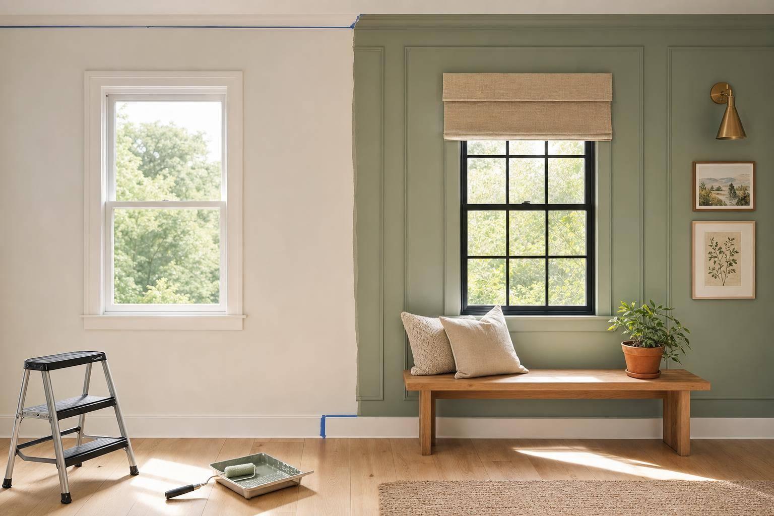
- Use paint where people least expect it. Accent doors and ceilings often create more impact than another neutral wall color.
- Treat windows as design features. Simple add-on mullions or Roman shades can make plain windows feel more architectural.
- Large-scale art doesn’t need to be traditional art. Rugs, quilts, and textiles can fill a wall beautifully and often cost less.
- Customize affordable furniture. Swapping legs can quickly change the style of a cabinet, chair, or console.
- Small details matter. Hiding or refining visible cords helps a room feel cleaner and more finished.
- Fresh flowers are a low-cost styling tool. Even simple single-variety arrangements can make a room feel more alive.
sbb-itb-a0e5ae3
Why These DIY Upgrades Work So Well
Most budget upgrades fail for one of two reasons: they are either too trendy, or they do not solve the real visual problem in the room.
The strongest ideas in this video work because they address common design gaps:
- trim that feels undersized
- windows that look flat
- lighting that feels limited
- furniture that lacks character
- rooms that need contrast or texture
In other words, these are not random hacks. They are ways to add scale, depth, contrast, and customization – the same qualities that make professionally designed spaces feel memorable.
1. Build a Taller Baseboard by Layering Trim
One of the smartest ideas from the video is also one of the most adaptable: add trim above an existing baseboard instead of tearing the old one out.
If your current baseboards are short and plain, removing them can create a chain reaction of repairs. You may need patching, repainting, floor touch-ups, or adjustments around quarter-round. Layering a second trim piece above the existing board avoids much of that disruption.
Why it works
This technique creates the illusion of a deeper, more substantial baseboard profile. When everything is painted the same color, the eye reads it as one custom assembly rather than multiple parts.
Best use cases
- Older homes where existing trim is worth preserving
- Builder-grade homes with short stock baseboards
- Office interiors that need a more finished client-facing look
- Hallways and entryways where trim is highly visible
Design note
Leaving a small gap between trim pieces can actually improve the effect. That painted strip of wall becomes part of the profile and makes the trim feel more architectural.
For property owners thinking long-term, this is a high-impact, low-demolition solution.
2. Rethink Sconces in Rooms Without Wiring
Lighting can change the mood of a room faster than almost any other upgrade, but permanent electrical work is not always practical. The video highlights a useful workaround: some hardwired sconces can be converted for plug-in use.
That opens up more options for renters and for homeowners who do not want to open walls just to add accent lighting.
Why this matters
Wall sconces often create a more intentional look than table lamps alone. They can frame a bed, add warmth to a hallway, soften a powder room, or make a waiting area feel more refined.
Where this idea fits
- Bedrooms without overhead symmetry
- Hallways that need visual interest
- Reading corners
- Small business interiors where ambient light matters
A practical caution
The video mentions the concept, but specific installation and electrical safety steps are not fully detailed in the video. For anyone attempting a lighting conversion, product compatibility and code considerations should be reviewed carefully.
The bigger design lesson is this: do not assume the fixture category limits the way you can use it.
3. Use Picture Rail Molding for Flexible Art Displays
Picture rail molding is a classic detail with modern relevance. Installed near the top of the wall, it allows artwork to hang from the rail rather than being nailed directly into the wall surface.
Why it stands out
This approach does two things at once:
- It adds architectural detail
- It makes art arrangements easier to change
That flexibility is valuable in both homes and businesses. A homeowner can rotate family art or vintage finds without filling walls with patch marks. A business owner can refresh a reception area seasonally with less hassle.
Best spaces for picture rail
- Dining rooms
- Hallways
- Living rooms
- Studios or creative workspaces
- Boutique commercial settings
Extra context
Historically, picture rail was especially useful in plaster-wall homes. Today, it also appeals to people who want a collected, heritage-inspired look. If your home in Spokane or Coeur d’Alene leans traditional, cottage, or transitional, this can add charm without feeling overly ornate.
4. Treat Rugs and Quilts as Large-Scale Wall Art
Large art can be expensive, especially when a room needs a single oversized focal point. The video suggests a compelling alternative: hang a rug, quilt, or textile on the wall.
This is more than a budget trick. It is a design move that introduces softness and texture in a way framed prints often cannot.
Why it works
Textiles absorb light differently than painted canvas or glass-covered art. That creates warmth and dimension – especially useful in spaces with hard finishes like concrete, tile, or LVP flooring.
Good applications
- Living rooms with tall blank walls
- Bedrooms that need softness
- Offices or conference rooms that feel sterile
- Entry spaces where art needs scale
What to consider
Not every rug belongs on a wall. Look for:
- visual pattern
- woven texture
- color palette that supports the room
- manageable weight
The video mentions that some designers even frame textiles. That can create a more formal look, while direct hanging tends to feel more relaxed and organic.
5. Paint Accent Doors and Ceilings for Instant Character
This tip may offer the highest return for the lowest cost: paint somewhere unexpected.
Accent walls have become common, but accent ceilings and interior doors still feel more deliberate. The video points out that unusual color placement often makes a room feel more designed because it creates tension and contrast.
Why this approach is effective
Most rooms are visually predictable. The moment you paint a ceiling a warm tone or a hallway door a bold color, the space gains identity.
Strong candidates for this treatment
- Powder rooms
- Hallways
- Bedrooms
- Laundry rooms
- Home offices
- Retail dressing rooms or boutique entries
Strategic advice
Before choosing color, think about the role of the surface.
- Ceilings can add warmth, intimacy, or drama
- Doors can punctuate repetitive spaces, especially hallways
- Trim-adjacent areas can help connect rooms visually
This technique is especially useful in smaller rooms where a full redesign is unnecessary but the space still feels forgettable.
6. Add Window Mullions to Plain Windows
Builder-grade vinyl windows often function well but lack visual character. The video offers a practical solution: apply removable or semi-removable mullions to create pane divisions.
Why this is effective
Windows carry a lot of visual weight. When they are completely flat and uninterrupted, they can make a room feel newer in a generic way. Divided-light patterns instantly add rhythm and style.
What this can help achieve
- cottage or farmhouse character
- traditional detailing
- old-house charm in newer construction
- stronger alignment with other architectural features
Good places to use mullions
- Kitchens
- Breakfast nooks
- Living rooms
- Front-facing windows
- Sunrooms
The video mentions different styles, including grid and diamond patterns. The best option depends on your home’s architecture. A diamond pattern can feel more decorative, while simple grids usually fit a wider range of homes.
Maintenance note
The video describes using adhesive mounting points and removing the inserts for cleaning. That makes this a relatively accessible cosmetic upgrade rather than a full window replacement decision.
7. Upgrade Furniture by Swapping the Legs
If a cabinet, bench, or chair feels close to right but not quite there, the problem may be the base. The video recommends changing the legs to alter the entire silhouette.
This is a strong design lesson: proportions often matter more than finish.
Why leg swaps make such a difference
Furniture legs influence:
- visual weight
- style era
- perceived quality
- openness versus bulk
A chunky base can make a simple cabinet feel grounded and custom. Slender metal legs can modernize a heavier piece. Turned wood legs can add traditional character to basic furniture.
Great candidates for a leg upgrade
- media consoles
- sideboards
- desks
- vanities
- accent chairs
- IKEA cabinets and similar flat-pack pieces
For business owners, this can also be useful in commercial refreshes. Reception furniture, retail display tables, or lounge pieces can often be updated without full replacement.
8. Make Lamp Cords Less Visible – or More Intentional
Few things disrupt a styled room faster than an awkward cord pile. The video shares two useful perspectives:
- shorten visible cord where possible
- if it must remain visible, treat it as part of the design
Why this matters
Cords are small, but they signal whether a room feels resolved. A beautiful lamp loses impact when excess cord loops across a tabletop.
Ways to improve the look
- reduce visible slack when the lamp design allows
- use twisted or better-looking cords
- add cord sleeves or fabric covers
- coordinate cord color with the wall or furnishing
Broader design lesson
Not every practical element needs to disappear. Some can be refined instead. That mindset is especially helpful in older homes, workshops, studios, or mixed-use spaces where function and aesthetics need to coexist.
9. Use Roman Shades in Smaller Spaces
Roman shades earn praise in the video for good reason: they bring softness without overwhelming the room.
In compact spaces, full drapery can feel bulky. Roman shades give privacy and texture while keeping the window area visually clean.
Why they work
They sit close to the window, stack neatly, and can introduce natural material or color without using excessive fabric.
Ideal places for Roman shades
- kitchens
- bathrooms
- breakfast areas
- offices
- narrow bedrooms
- small storefront or salon windows
Design advantage
Roman shades often look more tailored than basic blinds. If custom drapery is not in the budget, they can still create a high-end effect – especially in bamboo, linen-look, or patterned fabric.
The video notes that DIY versions are also possible, which gives homeowners more freedom to match the room exactly.
10. Style with Fresh Flowers for a Finished Look
Not every upgrade has to involve tools. One of the simplest ideas in the video is also one of the most universally effective: fresh flowers make a room feel complete.
Why florals have such strong impact
Fresh arrangements add:
- movement
- color variation
- natural texture
- a sense of care
Even simple blooms can soften hard surfaces and make a home feel lived in rather than staged.
A practical styling tip from the video
Instead of mixing many flower types, the video favors using multiple bunches of a single bloom. That approach often looks cleaner, fuller, and easier to arrange.
Where flowers make the biggest difference
- kitchen islands
- dining tables
- powder rooms
- reception desks
- conference tables
- open house staging
For both homes and businesses, this is one of the fastest ways to elevate the atmosphere before guests or clients arrive.
What Homeowners and Small Business Owners Can Learn from These Ideas
While these upgrades come from residential DIY content, the larger principles translate well across many property types.
For homeowners
These ideas are useful when you want your home to feel more custom without committing to major construction. Several can be completed in a weekend, and many improve resale appeal by making the space feel more intentional.
For small business owners
If you manage a showroom, office, studio, or boutique service space, the same concepts help create a more polished customer experience. Better trim lines, improved lighting, tailored window treatments, and cleaner styling all influence how professional your space feels.
For renovation planning
These upgrades also work well as "bridge improvements." If a full remodel is years away, they let you improve the visual experience now without overspending on temporary fixes.
How to Prioritize These Upgrades
If you are deciding where to start, use this simple framework:
Start with architecture
Choose:
- layered baseboards
- picture rail
- window mullions
These changes give the room stronger bones.
Then improve color and light
Choose:
- accent ceilings
- painted doors
- sconces
- better cord management
These upgrades reshape mood and focal points.
Finish with texture and styling
Choose:
- Roman shades
- textile wall art
- fresh flowers
These details make the room feel complete.
For many homes in North Idaho and Eastern Washington, this phased approach is practical because it spreads cost over time while still delivering visible progress.
Final Thoughts
The most useful takeaway from this video is not any single DIY trick. It is the broader design philosophy behind them: you do not always need to replace a feature to improve it.
A plain room becomes more interesting when you add scale, texture, contrast, and customization. Sometimes that means stacking trim instead of buying new millwork. Sometimes it means painting a ceiling, refining a lamp cord, or turning a textile into art.
These are not dramatic, all-or-nothing renovations. They are targeted decisions that help a space look more finished and feel more personal. And for homeowners or business owners who care about durability, value, and visual impact, that is often the smartest kind of upgrade.
Source: "10 DIY Hacks that TRANSFORM Basic Homes! Budget Friendly & Easy" – Lone Fox, YouTube, Oct 19, 2025 – https://www.youtube.com/watch?v=wqpK8toITxI